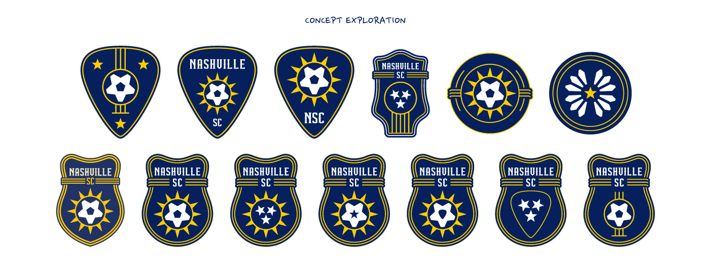
As a designer, a bucket list client for me has always been a professional football club. As practice, I made the decision to develop an “alternate” brand identity package for Nashville SC, an MLS team that began play in the league in 2020 as a continuation of the USL club.
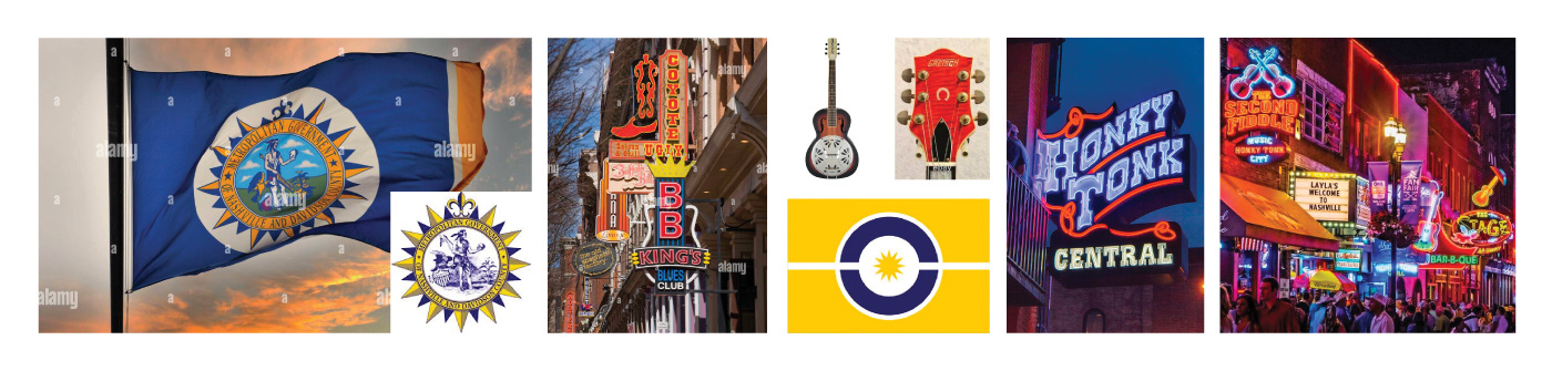
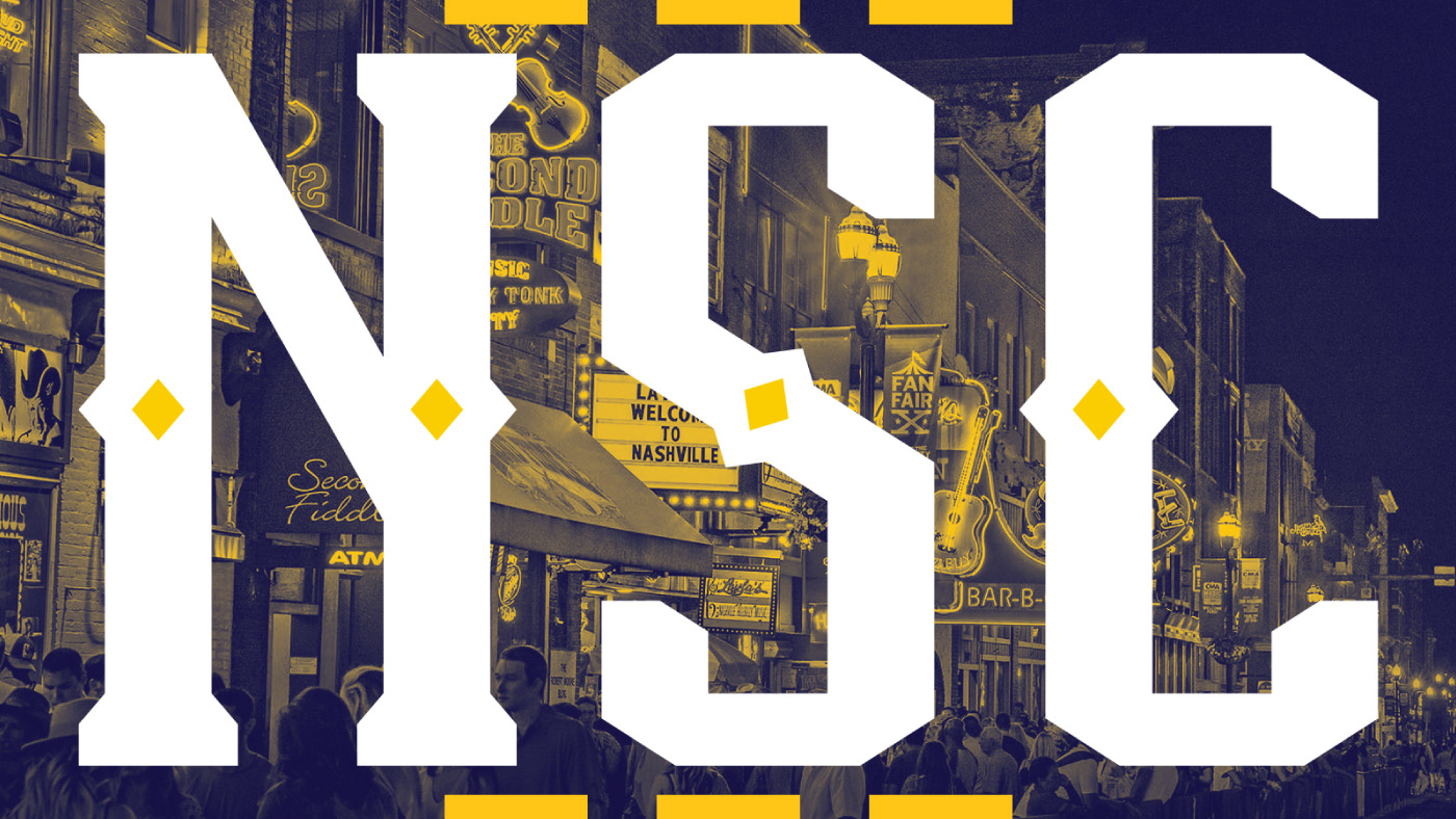
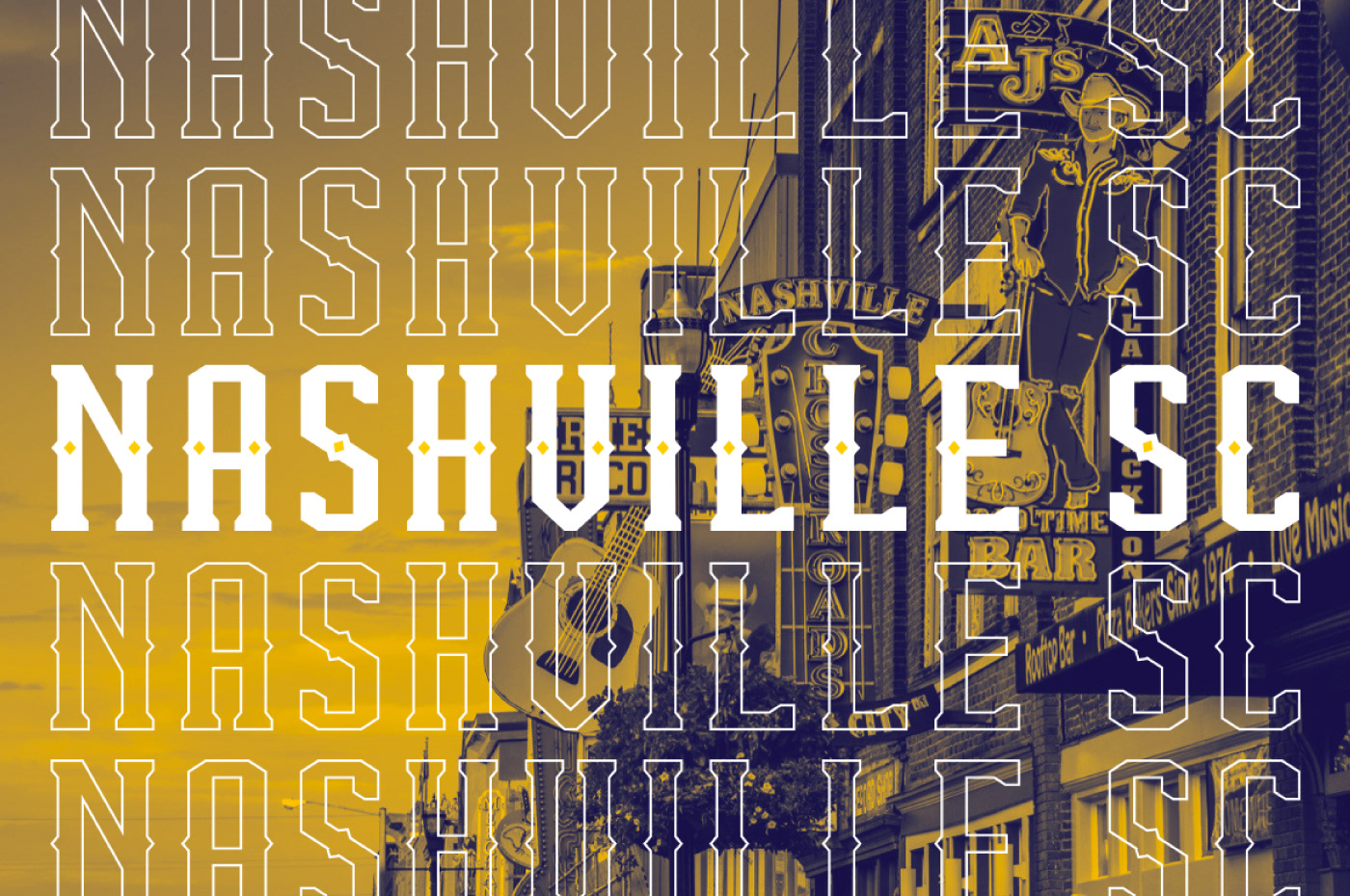
Nashville, TN, dubbed “Music City”, is routed deep into the music industry like no other city in North America. For this rebrand proposal, my goal was to explore this further by developing an identity that Nashville football fans could wear proudly and loudly across the city.
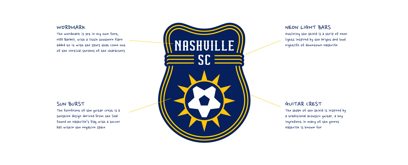
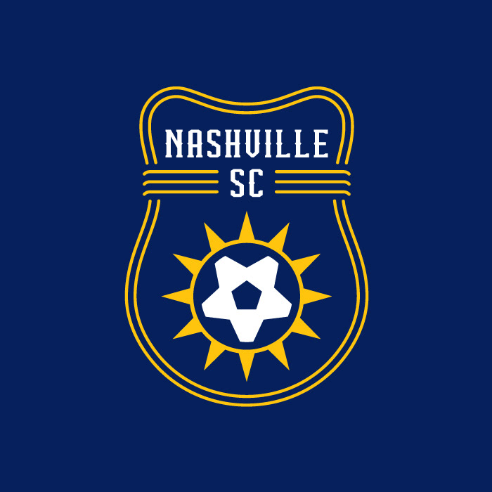
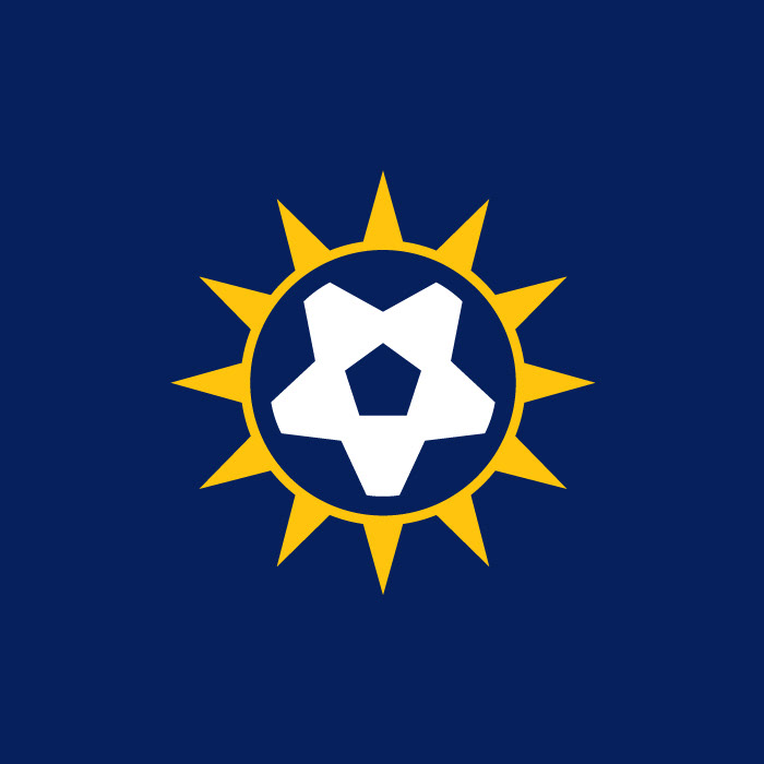
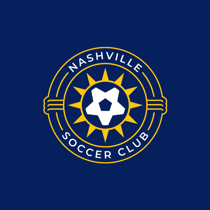
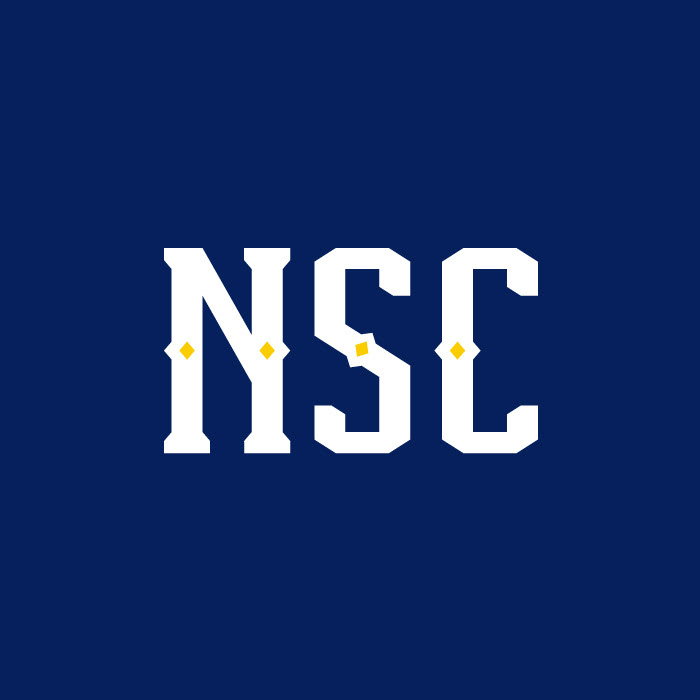
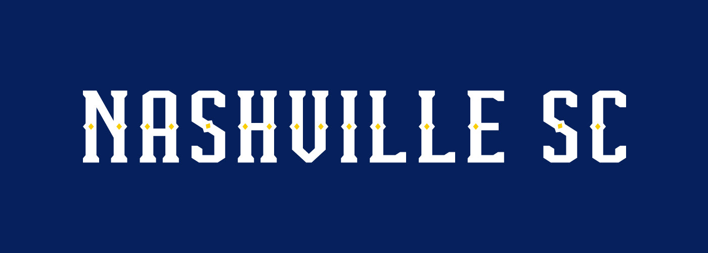
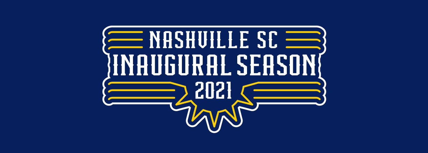
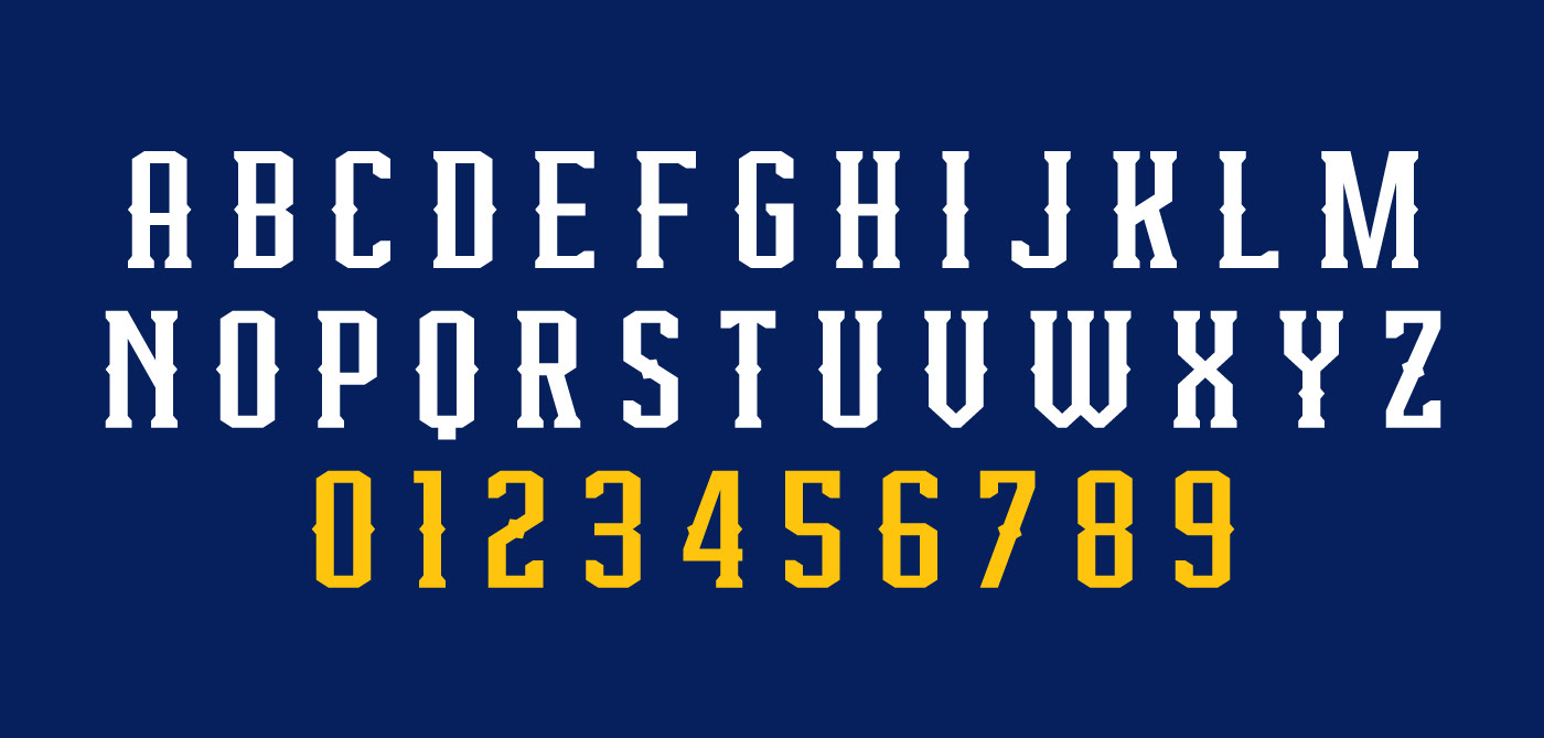
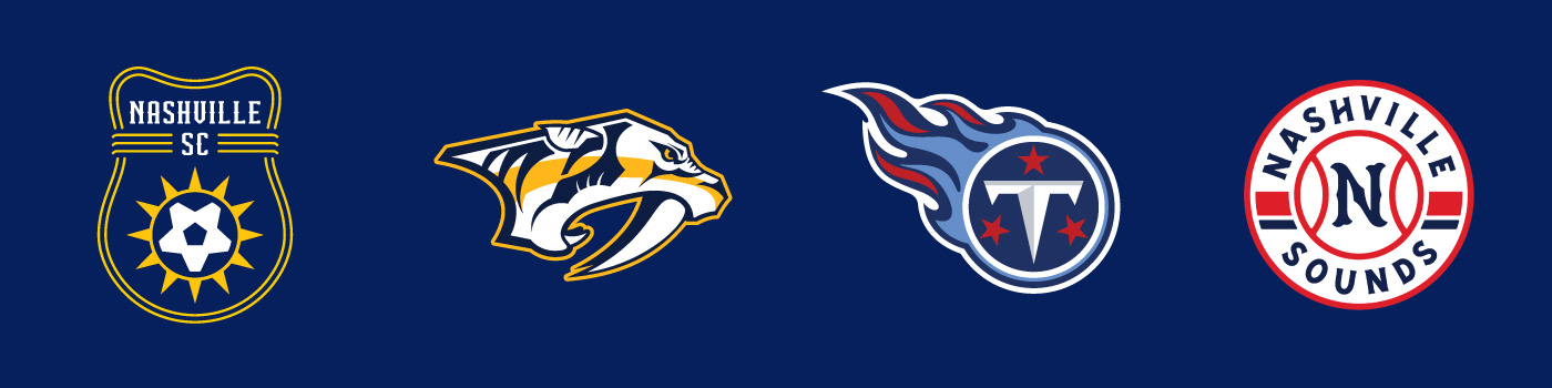
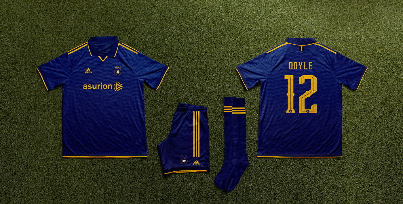
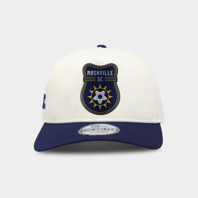
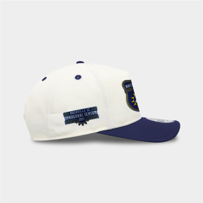
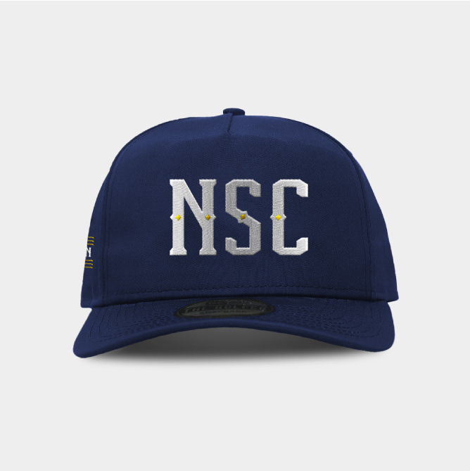
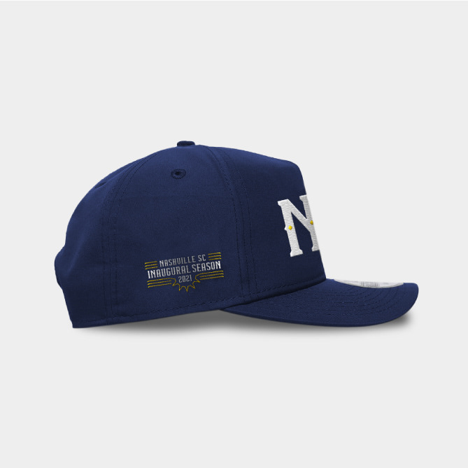
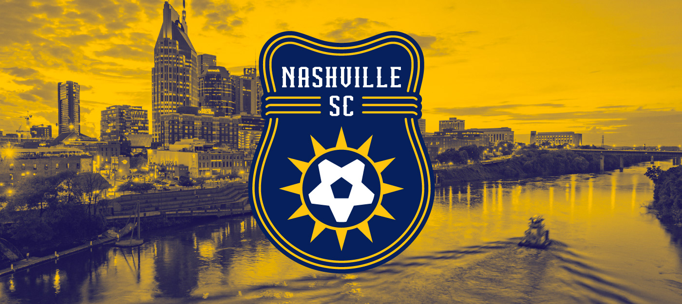
With a blank canvas in front of me, each design element I incorporated into my proposal has strong ties to Music City. The shape of the shield is inspired by a traditional acoustic guitar, a key ingredient in many of the genres Nashville is known for. Outlining the shield is a strip of neon lights inspired by the bright and loud nightlife of downtown Nashville. At the forefront of the guitar crest is a sunshine design derived from the Seal found on Nashville’s flag with a soccer ball within the negative space. The wordmark and accompanying type package are set in my own font, MDD Barbell, with a little southern flare added to it with the spurs that come out of the vertical strokes of the characters.