PSA: This is a personal project to explore new techniques, and develop my skills further as a designer. This project is in no way affiliated with the Toronto Maple Leafs.
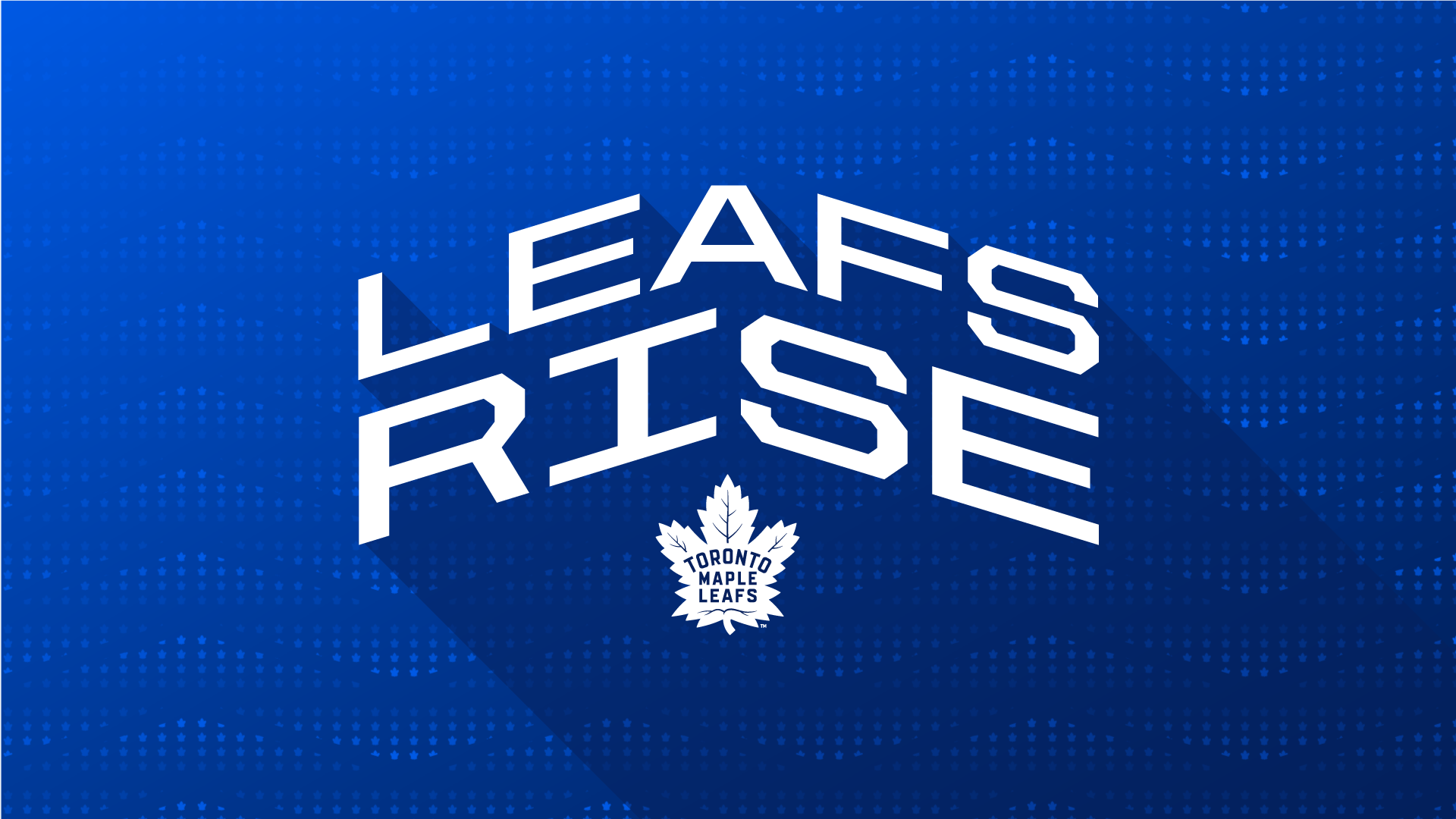
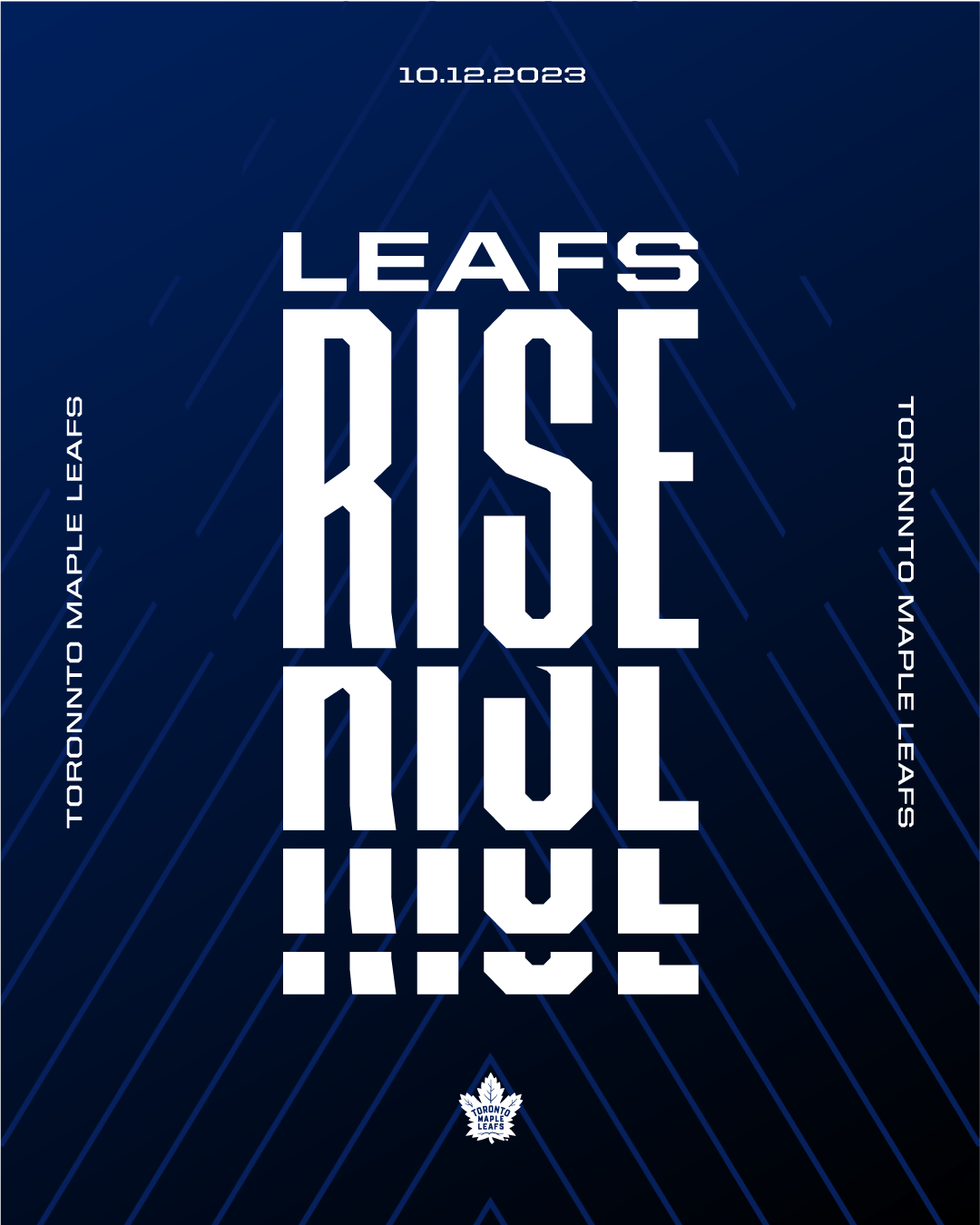
Leaves Fall, Leafs Rise
It is through the force of nature that leaves must inevitably fall. The Toronto Maple Leafs are challenging this notion through a radical change in perspective – the belief that Maple Leafs can rise.
We envision a culture where the Maple Leafs embrace resilience, break through limitations, inspire change, and rise above all as champions, leaving an indelible mark on this city and the sport we love.
Visualize The Rise
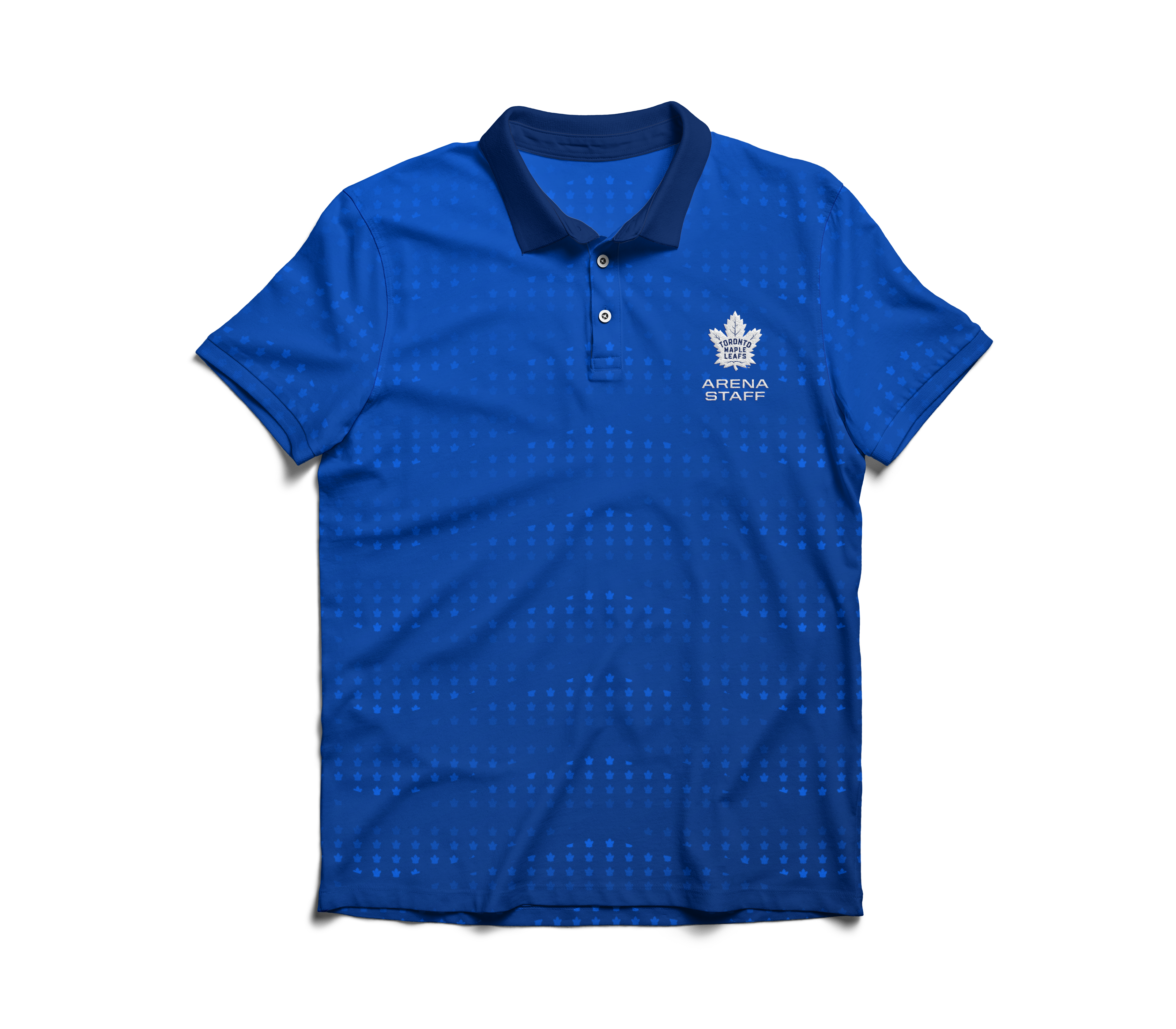
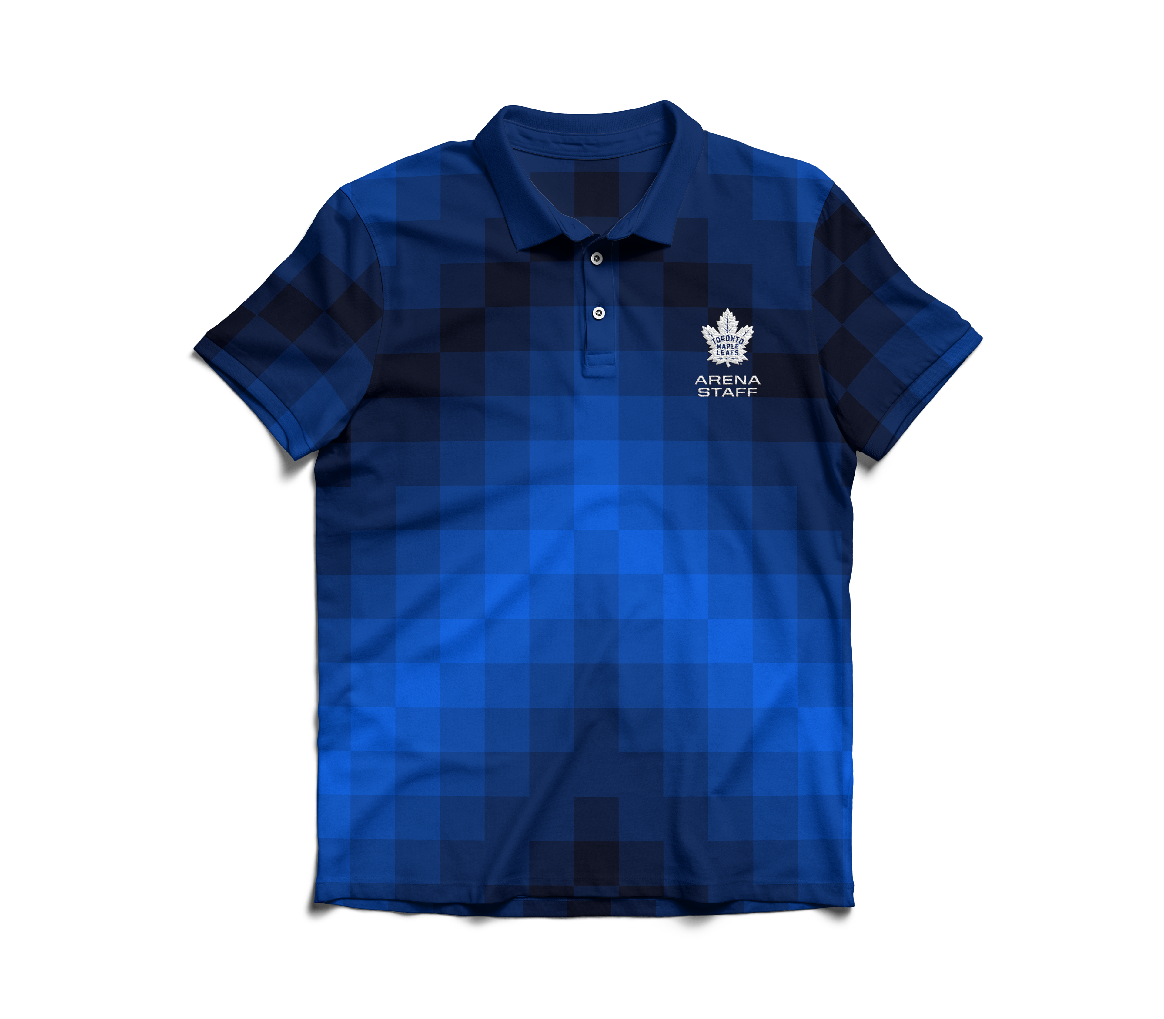
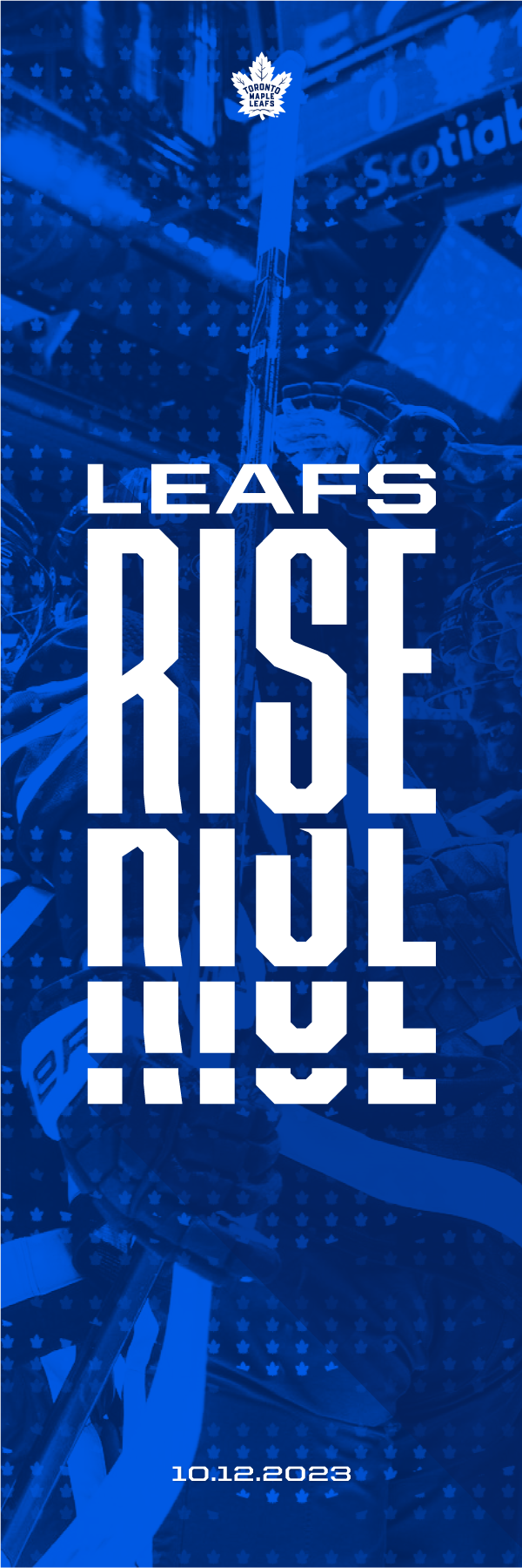
With the introduction of a new mantra, I developed a series of patterns all embodying the overarching theme of Leafs Rising, utilizing the logo in different ways to create upward motion while also showing versatility through it's adaptability into different colours.

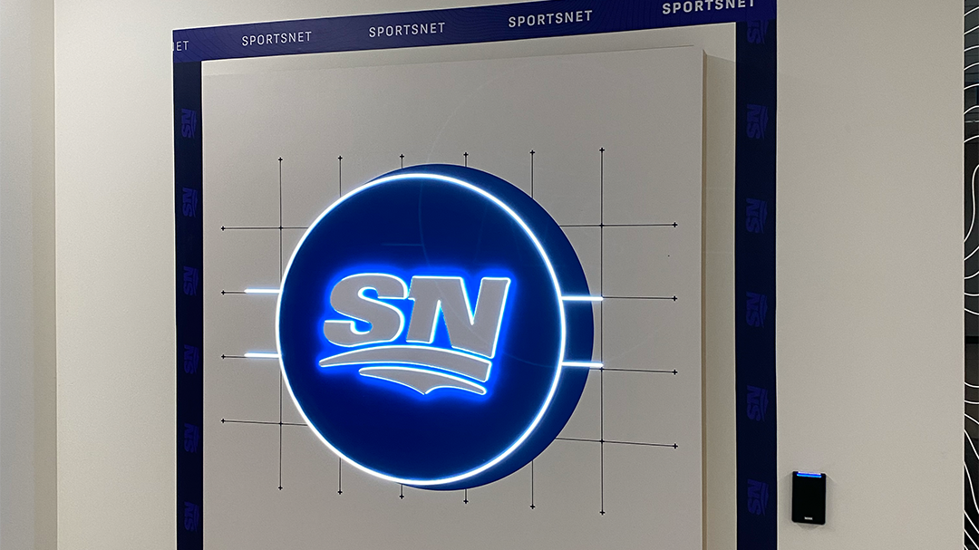
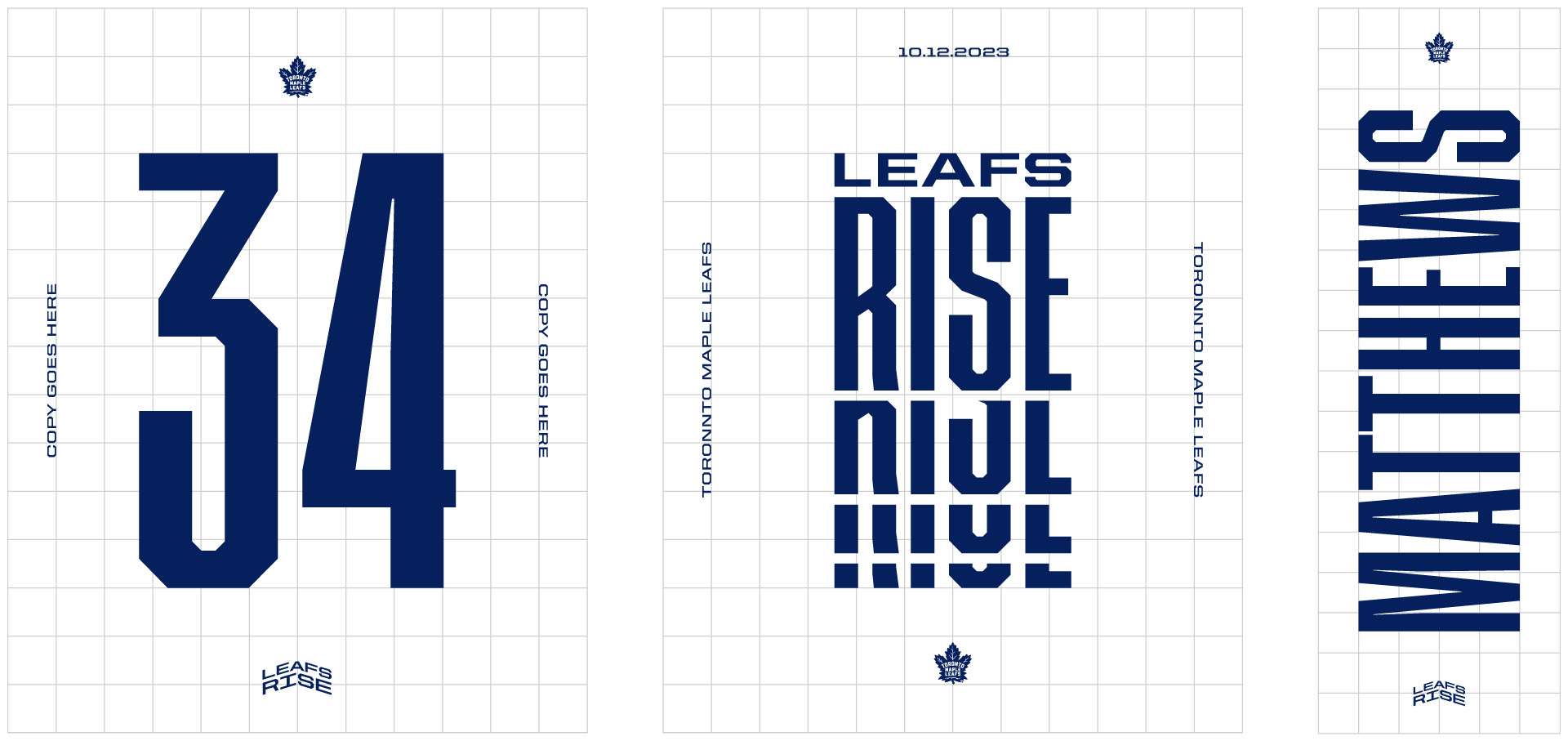
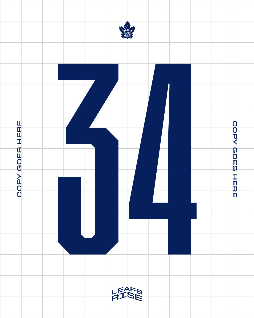
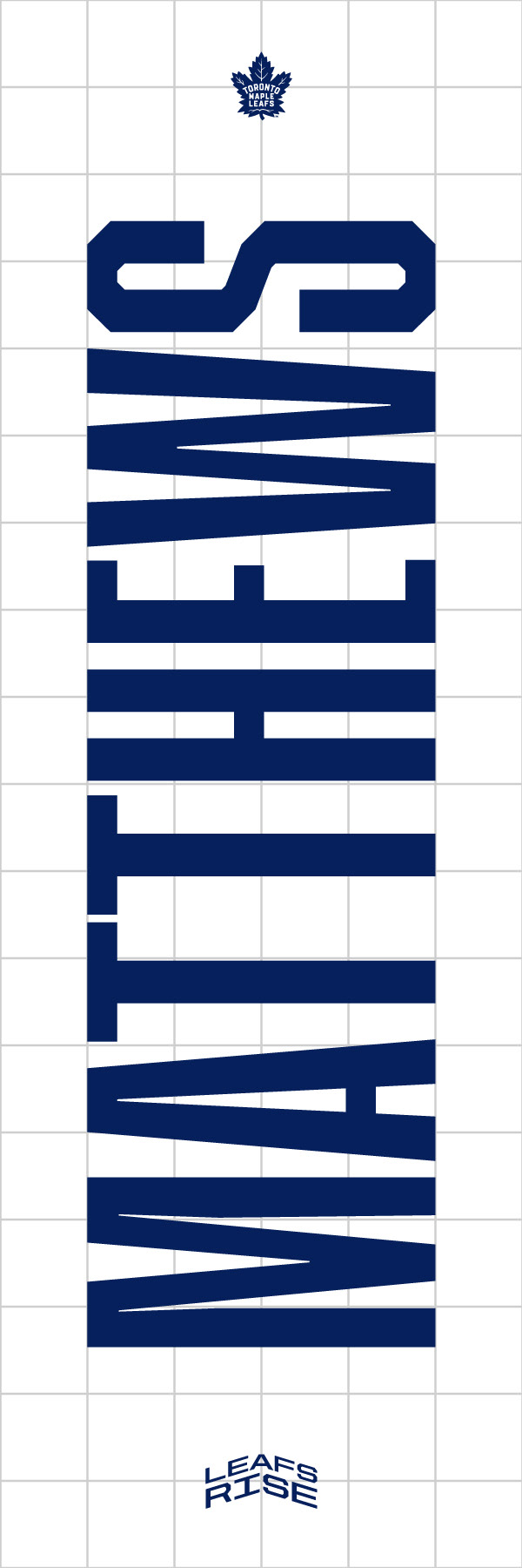
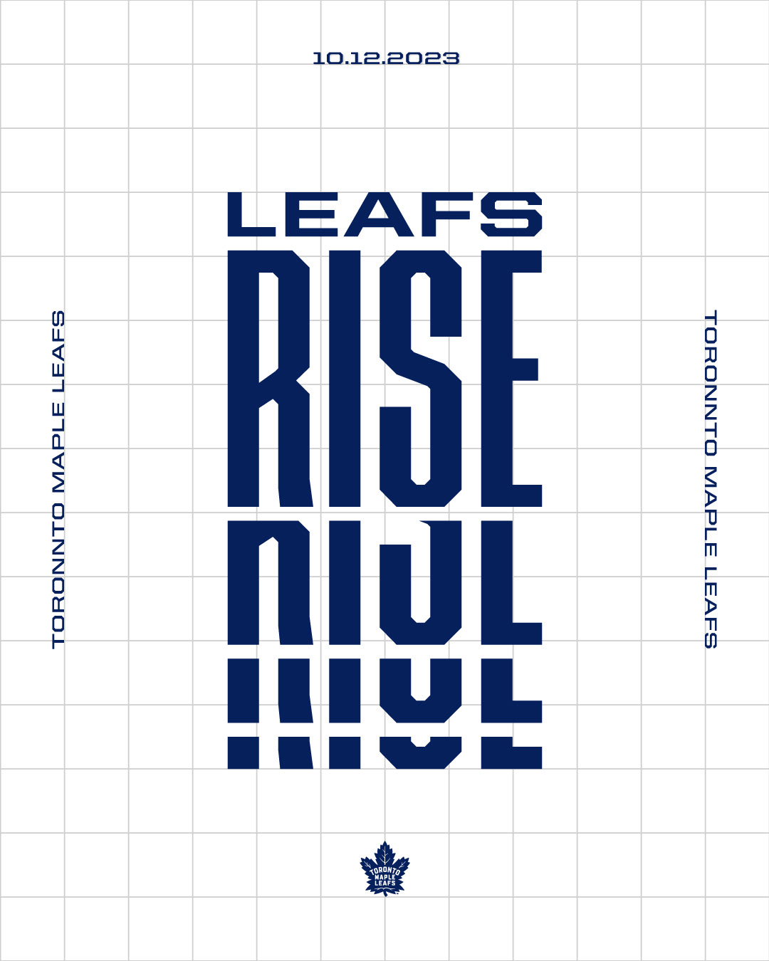
Building the Grid
In order to maintain visual consistency through different sizes of creative, a square grid is utilized in order for any designer to properly protect the integrity of the overall look.


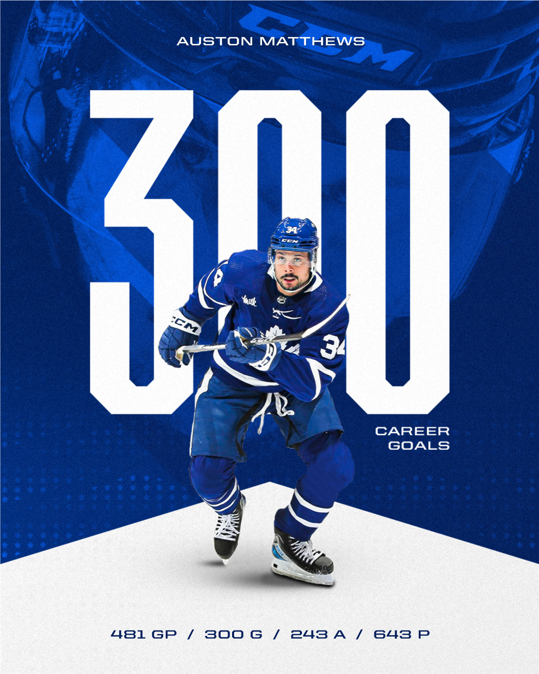


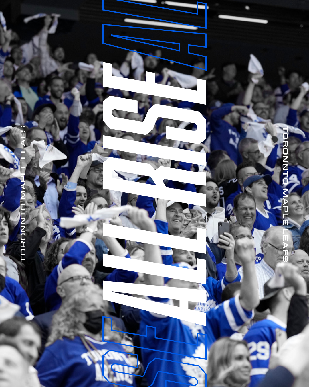
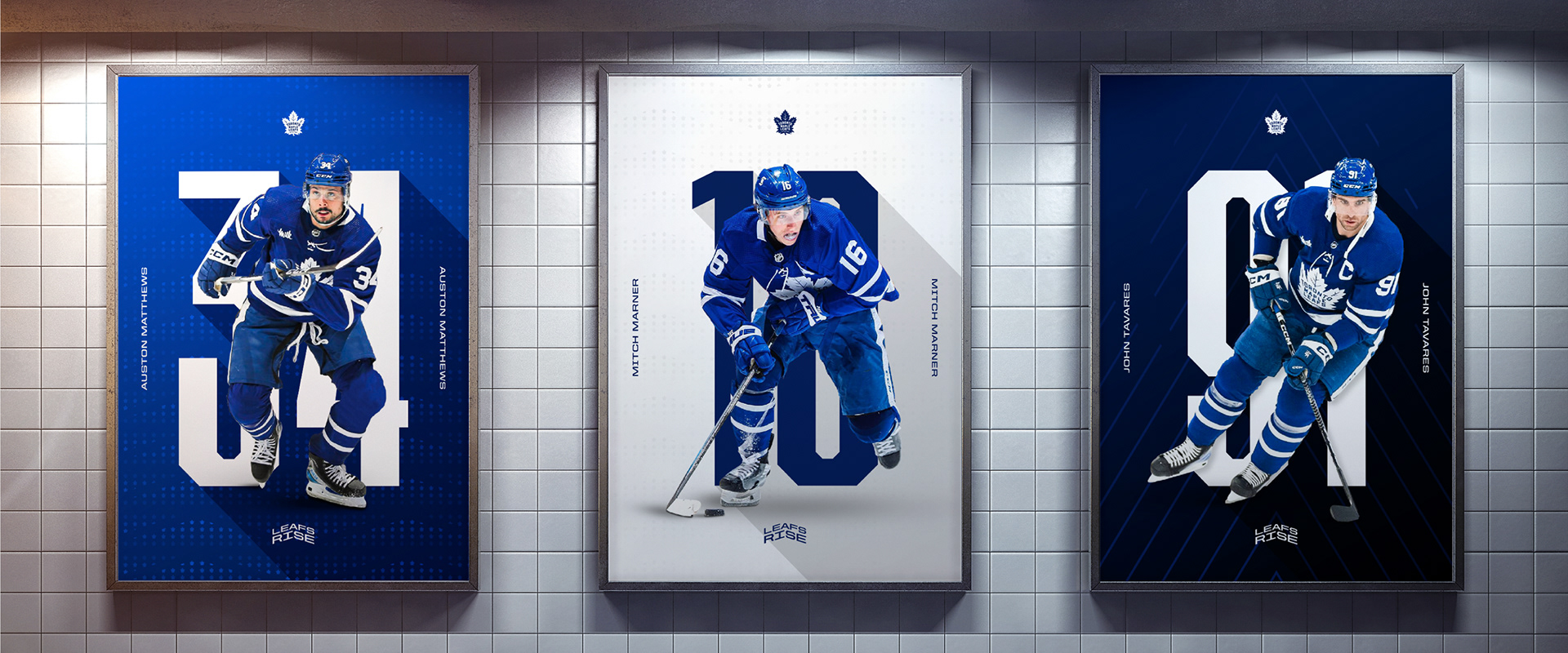
Extending the Rise Movement
Beyond creative, the new look will also provide opportunities for the game day experience to become more connected and cohesive. They are all part of the same team after all!