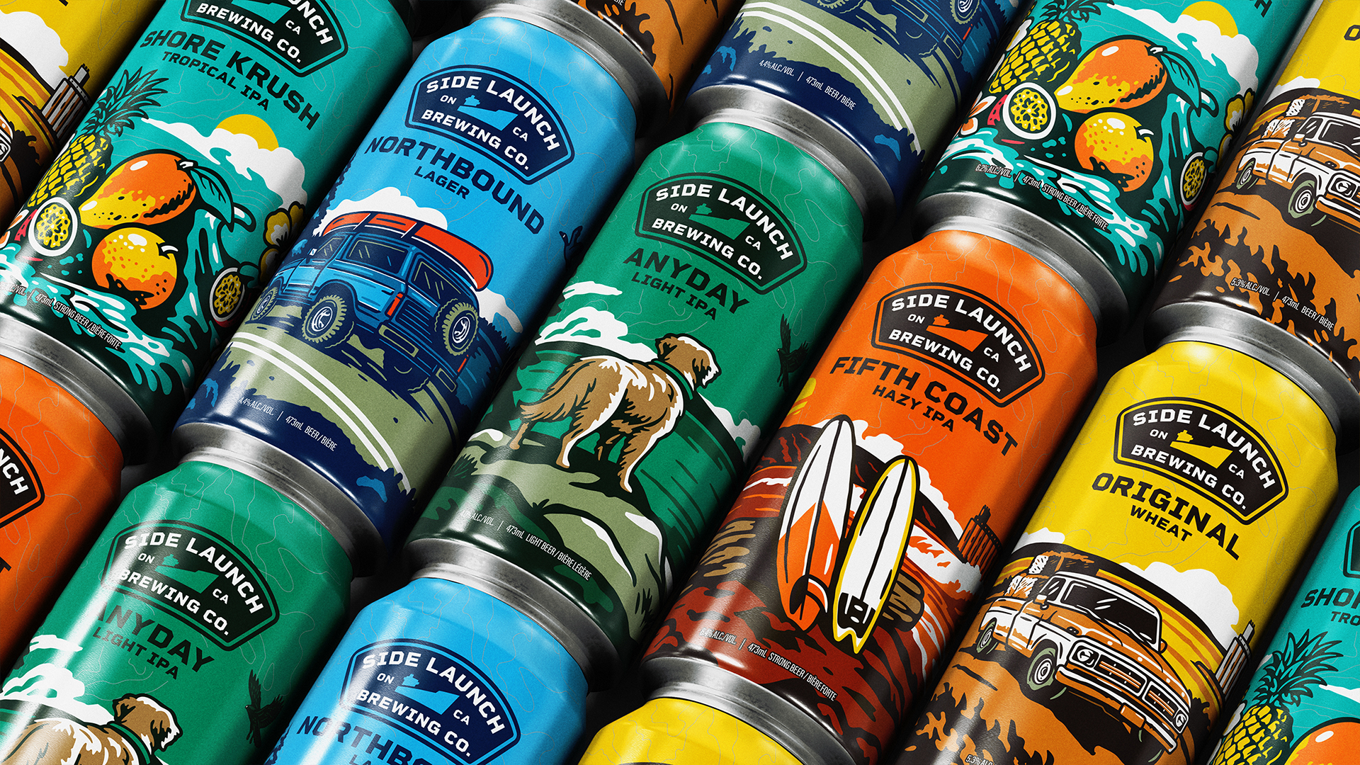
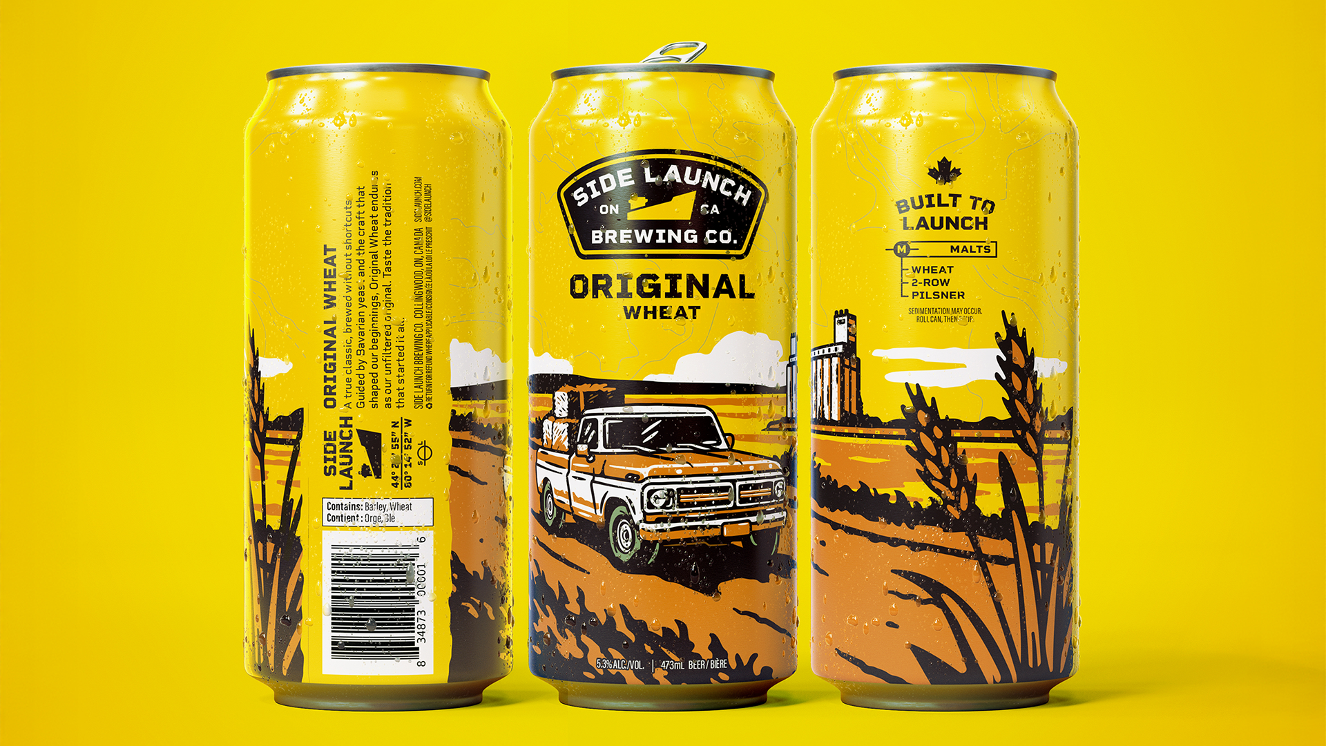
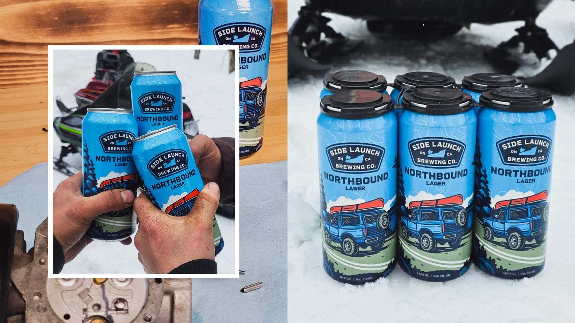
Side Launch Brewing Company Core Series Rebrand
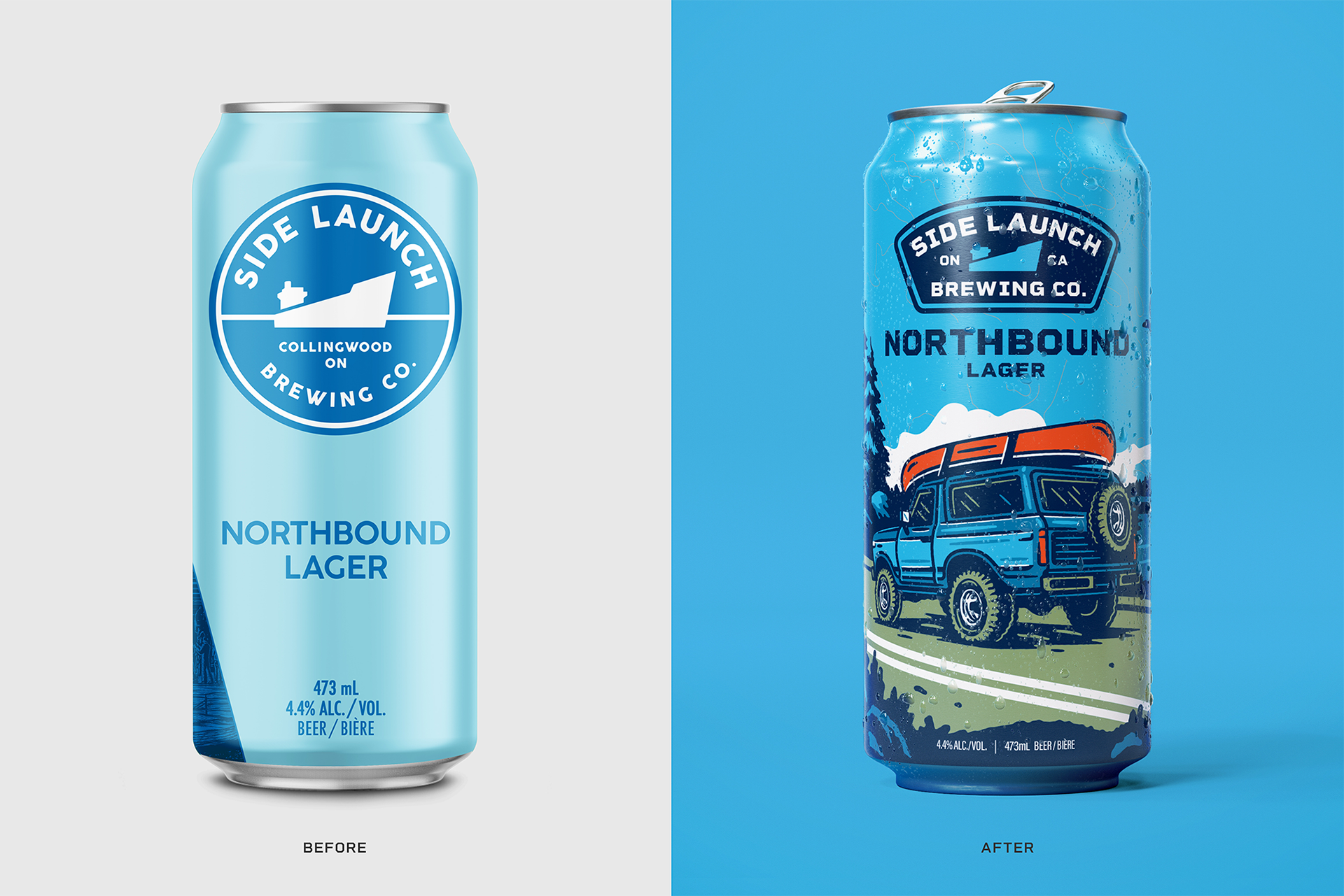
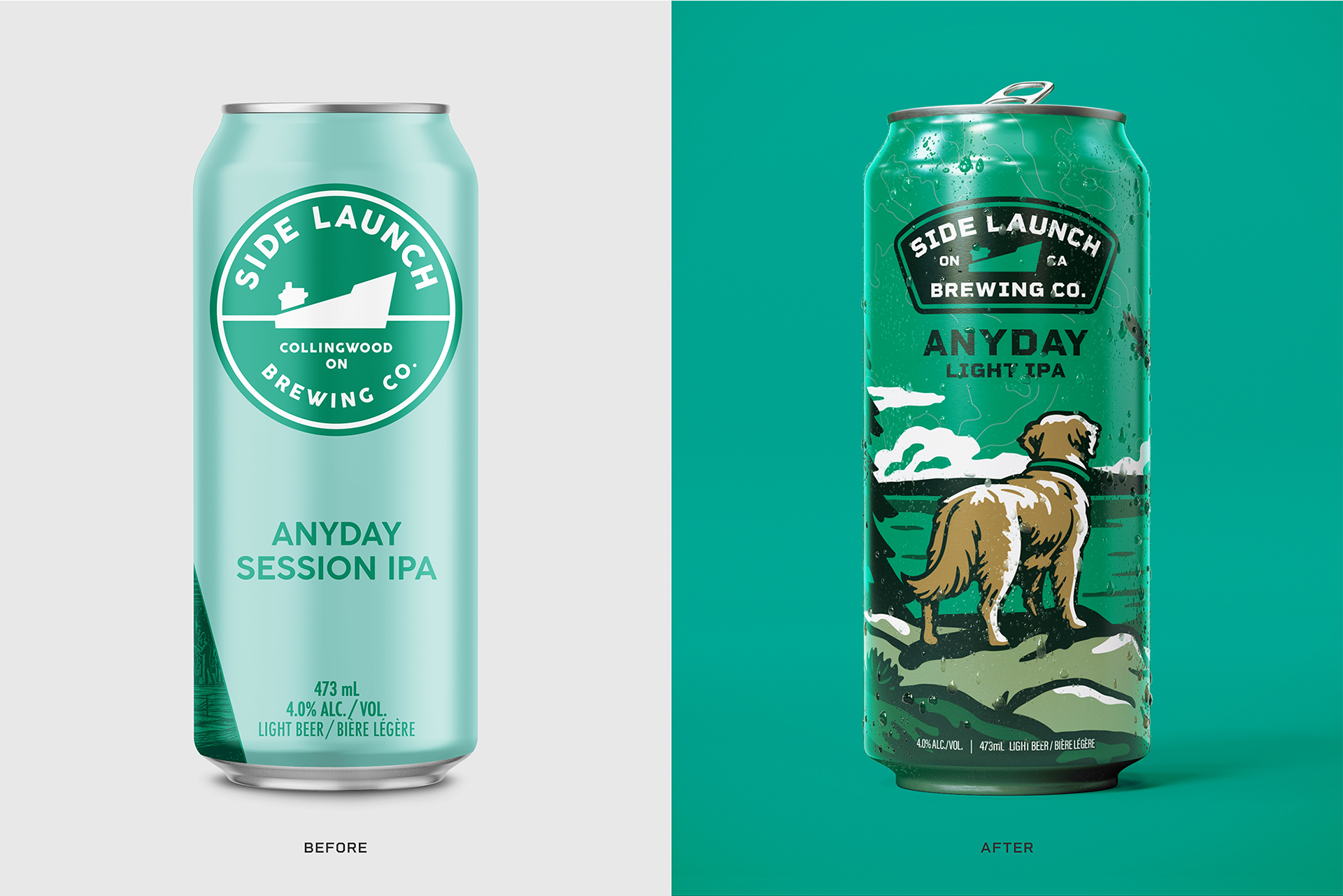
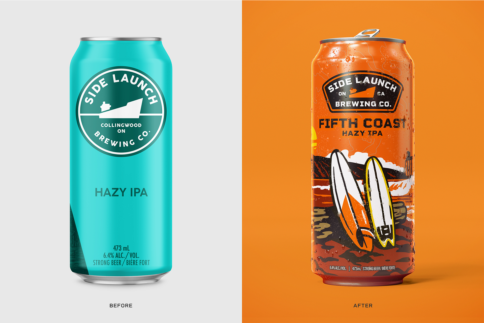
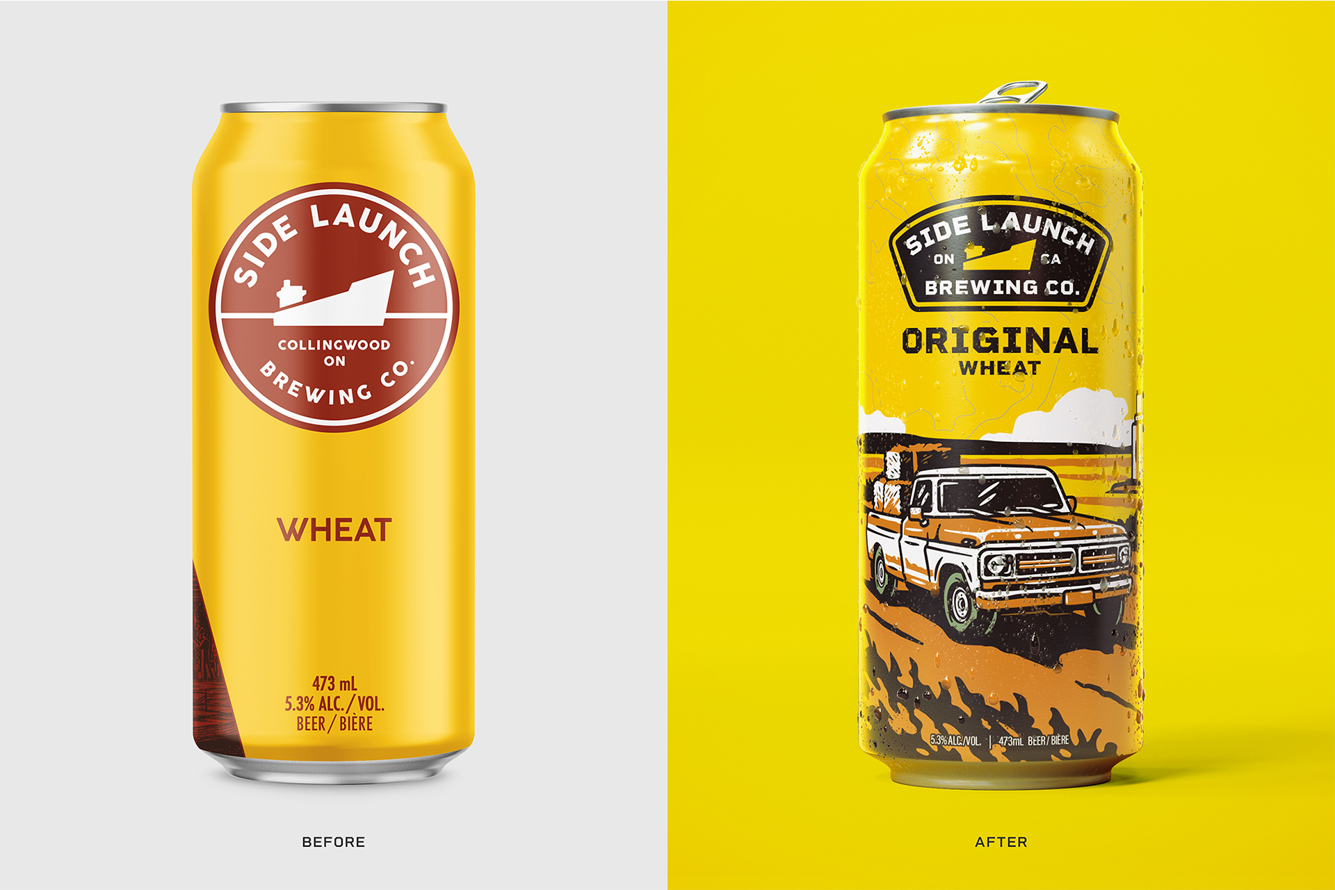
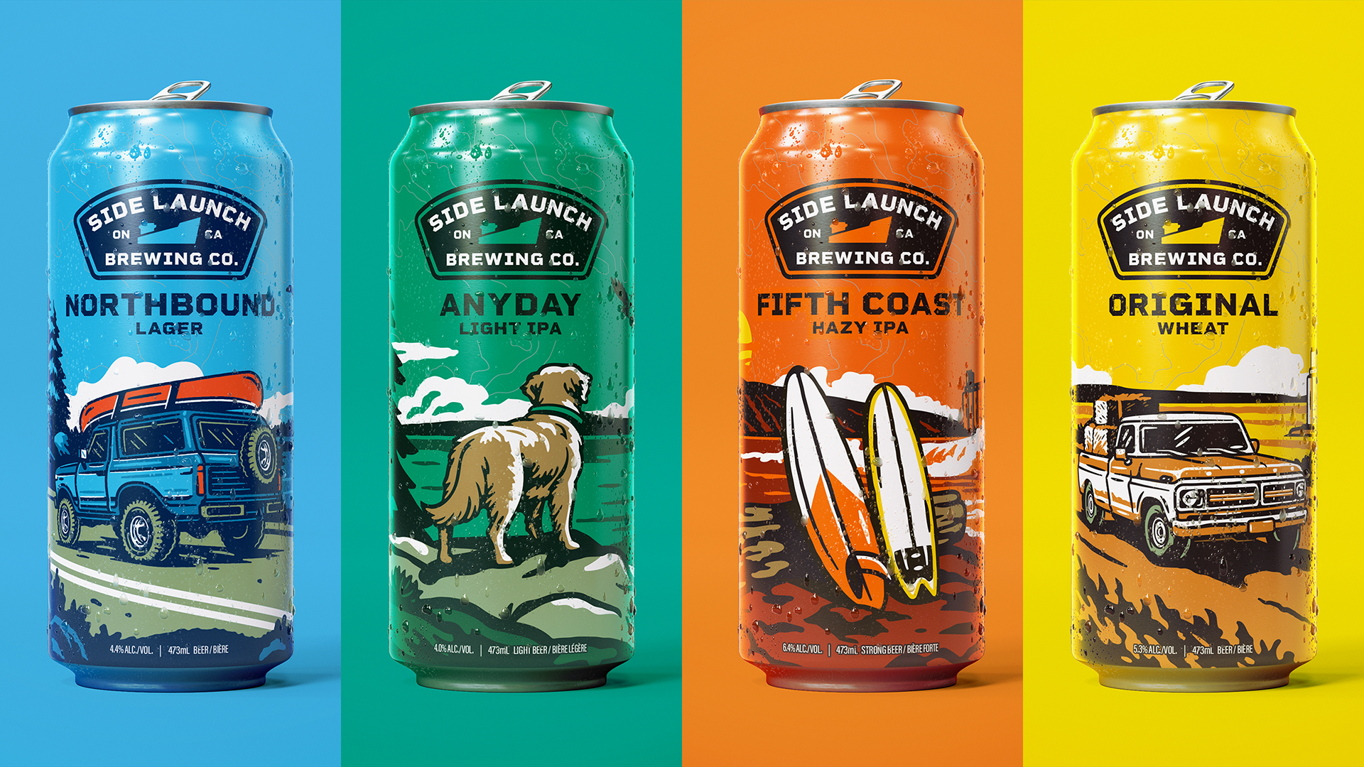
As part of a larger rebrand, Side Launch Brewing Company reimagined their identity through a refreshed core lineup by bringing new life to their four flagship beers while staying rooted in the spirit of Collingwood, Ontario. The project focused on creating a cohesive, illustration-led can series that reflects the brand’s deep connection to outdoor culture and everyday rituals.
Credits
Matt Doyle: Illustration
Steve St. Jean: VP of Brand, Creative & Marketing, Side Launch
Lauryn McLaren: Marketing Manager, Side Launch
Client: Side Launch Brewing Company
Matt Doyle: Illustration
Steve St. Jean: VP of Brand, Creative & Marketing, Side Launch
Lauryn McLaren: Marketing Manager, Side Launch
Client: Side Launch Brewing Company
Authentically Collingwood
To redesign the packaging for Side Launch’s flagship beers in a way that feels timeless, ownable, and reflective of place, we needed to balance strong shelf presence with an authentic connection to Collingwood’s lifestyle. The system needed to unify the lineup while allowing each beer to retain a distinct identity.
The Solution
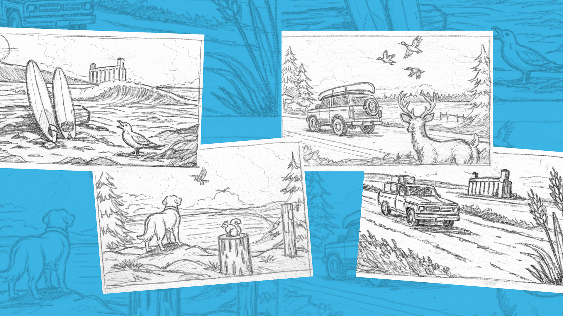
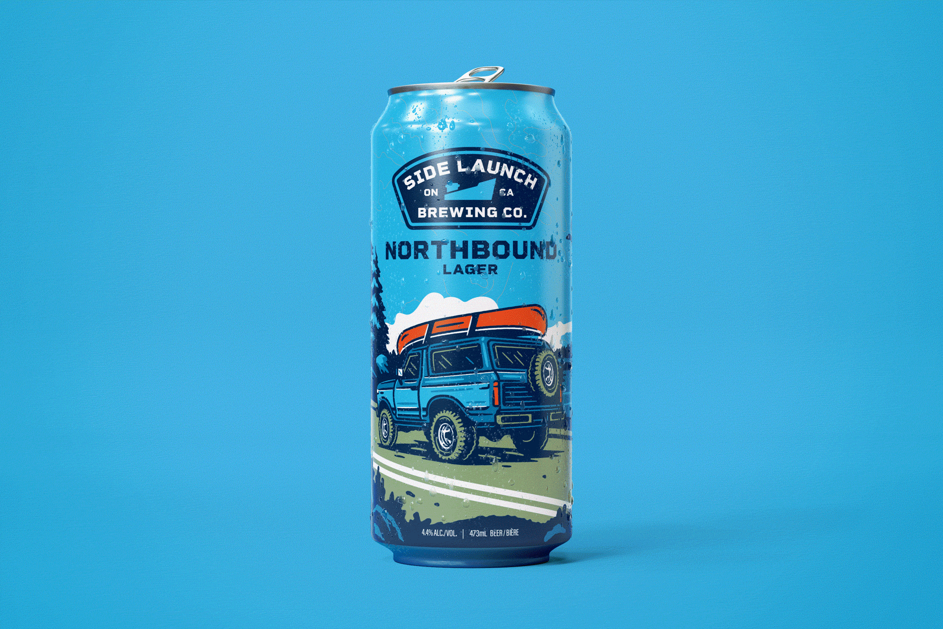
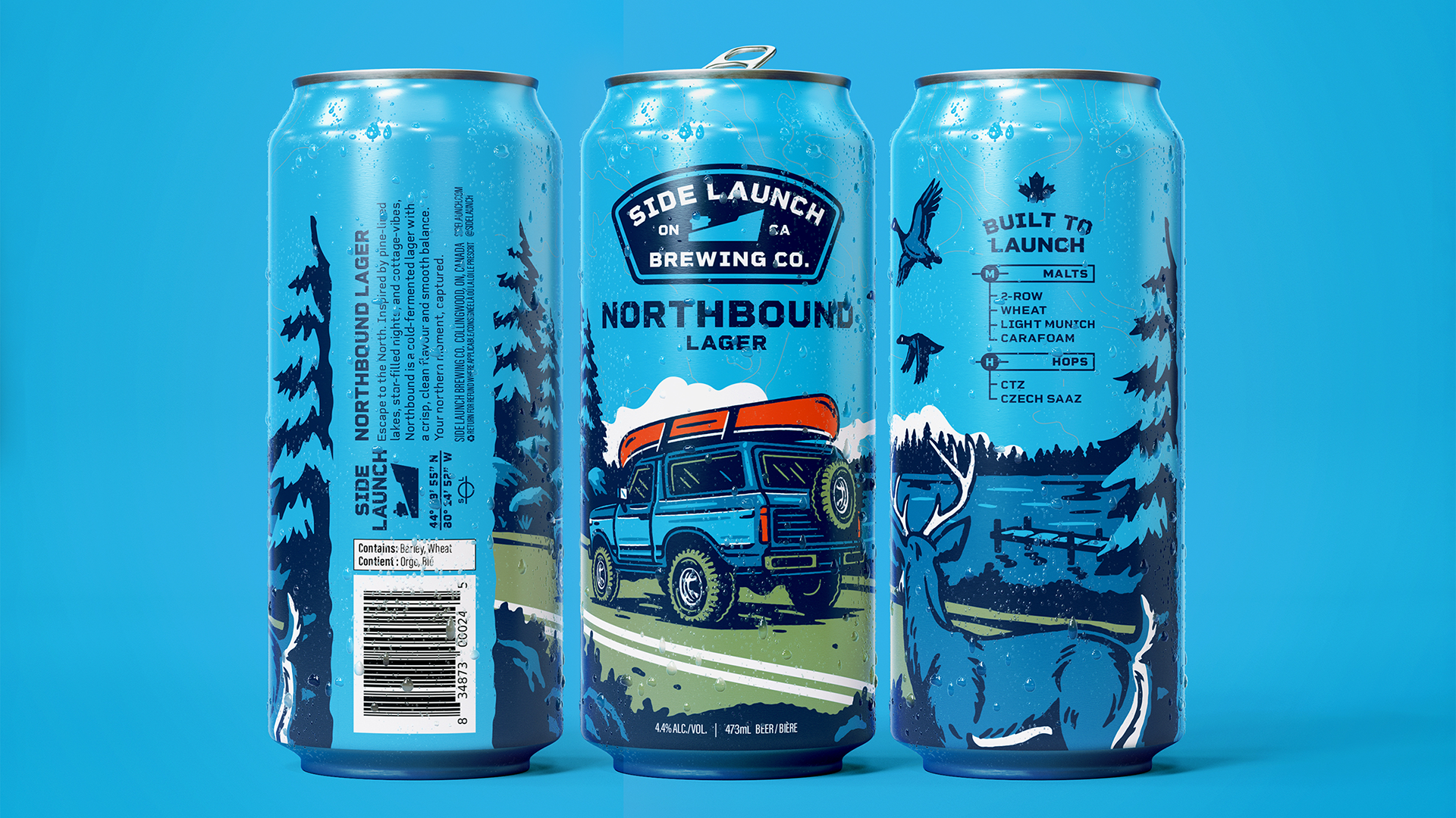
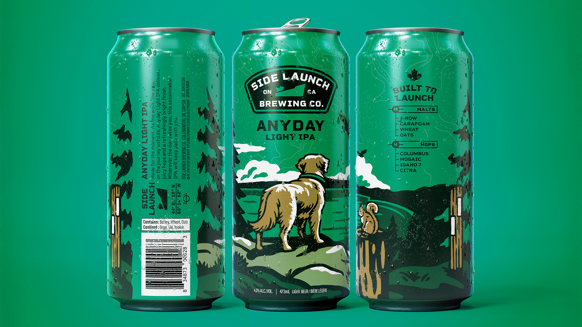
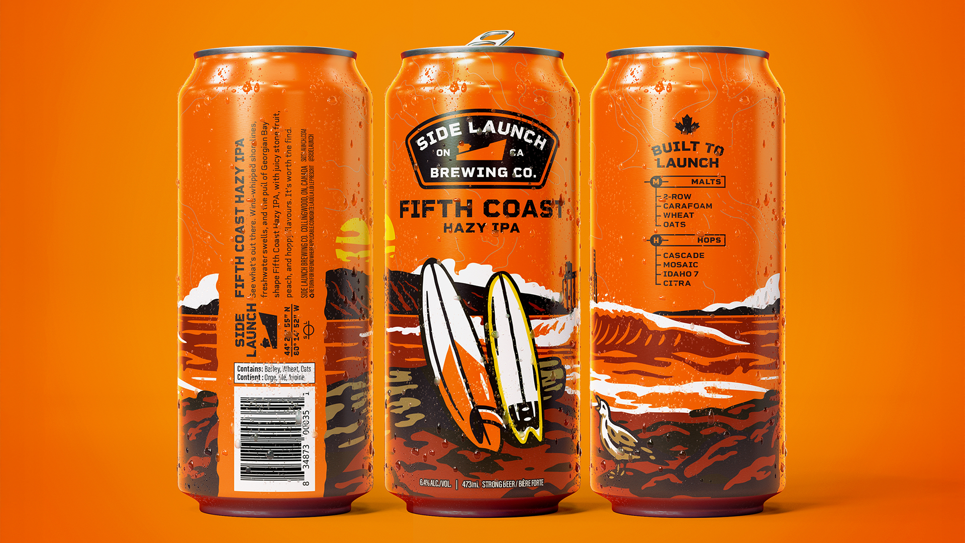
The solution centres on a narrative illustration system, where each can represents a specific moment tied to Collingwood living: shorelines, open roads, countryside, and outdoor escape. Rather than leaning into overtly literal or overused craft beer tropes, the work draws from real regional experiences to build a sense of familiarity and authenticity.
Visually, the direction blends modern clarity with a nostalgic sensibility, inspired by retro travel posters and vintage Americana. Bold colour blocking, simplified forms, and strong compositions ensure immediate readability, while the detail rewards closer inspection.
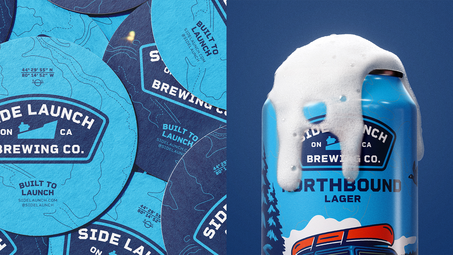
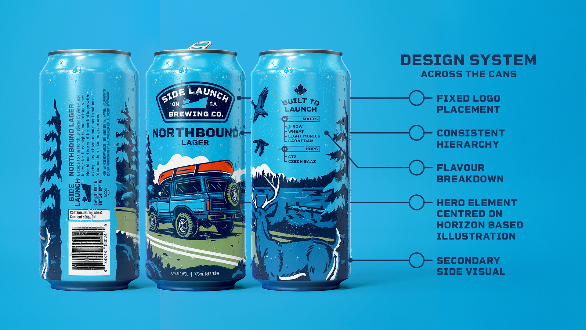
Design System
A structured system was developed to ensure consistency across the lineup. This framework allows each can to stand on its own while functioning cohesively as part of a recognizable family.
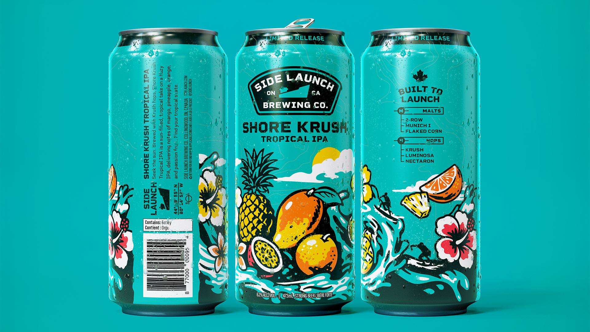
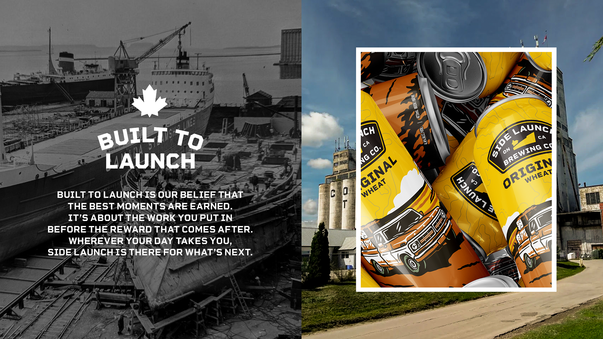
Built to Expand: Limited Releases
Beyond the four core beers, the rebrand was designed as a scalable system that could extend seamlessly into seasonal and limited-release offerings. The framework allows new beers to enter the family without disrupting the integrity of the core lineup. We do this by using the same compositional rules, typographic structure, and illustrative approach while introducing new colour palettes, environments, and storytelling moments.
This creates room for experimentation and collectability, giving limited releases their own sense of excitement while ensuring they still feel distinctly Side Launch on shelf.
The Final Result
The result is a core series that feels both cohesive and collectible. Designed for longevity in a lineup of beers that never change. The rebrand positions Side Launch as a modern craft brewery grounded in place, celebrating Collingwood’s outdoor culture through visuals that feel timeless, transportive, and distinctly their own.